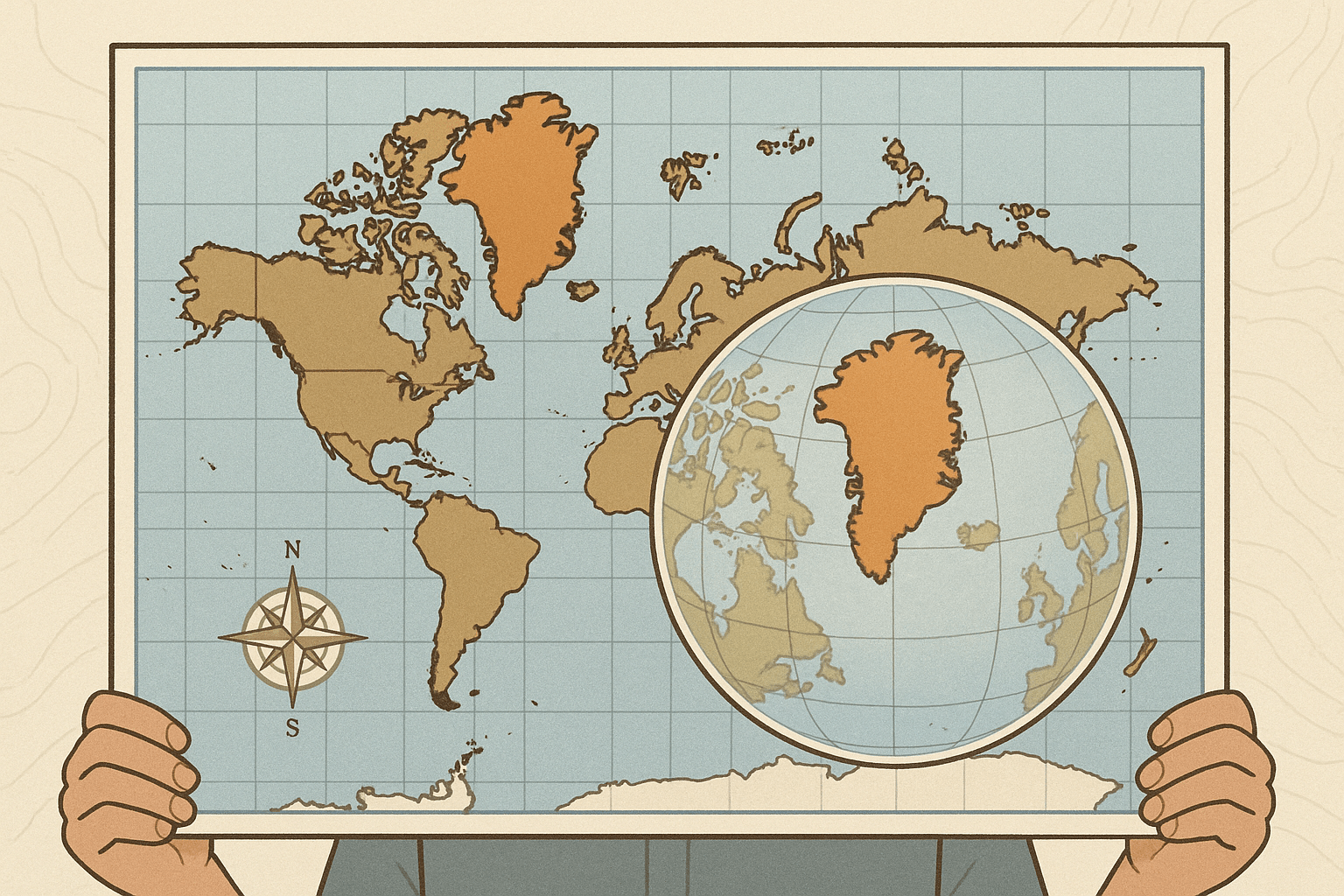
Take a look at a standard world map, the kind you’ve seen in classrooms your whole life. Find Greenland. Now, find Africa. They look roughly the same size, don’t they? Maybe Greenland is even a bit wider. Here’s a geographical truth that might shock you: Africa is more than 14 times larger than Greenland.
Welcome to the world of cartographic deception. It’s not necessarily a malicious lie, but a lie nonetheless. Every single flat map of the world is a distortion. It’s a mathematical and geometrical impossibility to represent the surface of a sphere on a flat plane without stretching, squashing, or tearing some part of it. The map you’ve trusted your whole life is fundamentally flawed, and understanding how is key to truly understanding our planet.
The Orange Peel Problem: Why Every Map is a Compromise
Imagine you have an orange. Now, try to peel it in one single piece and lay it flat on a table without breaking or stretching it. You can’t. The peel will either rip apart, or you’ll have to stretch the edges to make it lie flat. This simple, frustrating exercise is known as the “orange peel problem”, and it’s the exact challenge mapmakers have faced for centuries.
When projecting a 3D sphere onto a 2D surface, cartographers must choose what to sacrifice. Generally, there are four key properties that get distorted:
- Shape
- Area (size)
- Distance
- Direction
A map projection can preserve one or two of these properties, but it can never, ever preserve all four. Therefore, every map is a compromise, designed with a specific purpose in mind, which inevitably leads to some form of distortion.
The Mercator Projection: The World’s Most Famous Lie
The map you’re most familiar with is almost certainly the Mercator projection. Created by Gerardus Mercator in 1569, it was a revolutionary tool for its time. Its genius lies in what it preserves: direction. On a Mercator map, lines of longitude and latitude are straight and intersect at right angles. This creates lines of constant bearing, known as rhumb lines, which appear as straight lines on the map. For a 16th-century sailor, this was invaluable. You could simply draw a straight line from Lisbon to a port in the Caribbean, set your compass to that bearing, and (in theory) get there.
But this navigational convenience comes at a tremendous cost: area. To keep the grid rectangular, the Mercator projection dramatically stretches landmasses as you move away from the equator toward the poles. This creates a massively distorted view of the world’s geography.
Let’s look at some of its most egregious distortions:
- Greenland vs. Africa: As mentioned, Africa (30.4 million sq km) is 14 times larger than Greenland (2.2 million sq km), but on the Mercator, they appear comparable.
- Alaska vs. Brazil: Alaska looks as large as Brazil, but Brazil is actually five times bigger.
- Europe vs. South America: Europe appears larger than South America, but South America is nearly double Europe’s size.
- Antarctica: The southernmost continent appears as an impossibly enormous landmass stretching across the entire bottom of the map, when in reality it’s the fifth-largest continent.
This “Eurocentric” distortion has had a profound, if subconscious, impact on our perception of the world, making northern countries in Europe and North America appear much larger and more significant than equatorial countries in Africa, South America, and Southeast Asia.
The Gall-Peters Projection: A Controversial Correction
As awareness of the Mercator’s size distortion grew, a challenger emerged: the Gall-Peters projection. Popularized in the 1970s by Arno Peters, it is an “equal-area” projection. This means that all landmasses are represented with their correct proportional size. When you look at a Gall-Peters map, Africa and South America rightfully dominate the map, appearing long and stretched, while Europe and Russia are significantly smaller.
Proponents argued this was a more socially just and accurate representation of the world, de-emphasizing former colonial powers. In the 1980s, it was even adopted by some organizations and school districts, like Boston Public Schools, to provide a less biased worldview.
However, the Gall-Peters projection is not without its own severe flaws. To achieve its equal-area property, it heavily distorts the shape of countries, especially near the equator where they are vertically stretched and near the poles where they are horizontally squashed. Critics argue that it’s just as “wrong” as the Mercator, simply choosing a different distortion to prioritize.
Finding a Better Balance: Other Projections to Know
The Mercator vs. Peters debate highlights that there is no perfect map, only different tools for different jobs. Modern cartographers have developed “compromise” projections that try to minimize all types of distortion, even if they don’t preserve any single property perfectly.
- Winkel Tripel Projection: Adopted by the National Geographic Society in 1998, the Winkel Tripel strikes a balance between distortions of size, shape, and distance. It curves the lines of longitude and latitude, presenting a more “globe-like” feel and is now a common standard for general-purpose world maps.
- Robinson Projection: The predecessor to the Winkel Tripel at National Geographic, the Robinson projection is another compromise map with a visually pleasing, rounded appearance that makes the size distortion at the poles less extreme than the Mercator.
- Goode Homolosine Projection: This map directly confronts the “orange peel” problem by interrupting the oceans. It looks like a peeled and flattened globe. This allows it to preserve the area of landmasses very accurately, making it excellent for presenting data related to land, but completely useless for ocean navigation.
So, Which Map Is “Right”?
By now, the answer should be clear: none of them. Or, perhaps more accurately, all of them are “right” for a specific purpose.
The “right” map is the one that best serves its function. If you’re navigating the open ocean, the directionally true Mercator is your best friend. If you want to compare the true land area of different regions, an equal-area map like the Gall-Peters or Goode Homolosine is the correct choice. And if you want a general-reference map to hang on your wall that offers a good-looking, balanced view of the world, a compromise projection like the Winkel Tripel is an excellent option.
The most important takeaway is to become a critical map reader. The next time you look at a world map, don’t take it as an absolute truth. Ask yourself: What projection is this? What is being distorted to show me this view? What was the mapmaker’s purpose? By understanding the inherent lies within every map, you gain a truer, more nuanced understanding of the beautiful, complex, and spherical world we all share.